Re: Website patch request: documentation style update
| From: | "Jonathan S(dot) Katz" <jkatz(at)postgresql(dot)org> |
|---|---|
| To: | Tom Lane <tgl(at)sss(dot)pgh(dot)pa(dot)us> |
| Cc: | pgsql-www(at)lists(dot)postgresql(dot)org |
| Subject: | Re: Website patch request: documentation style update |
| Date: | 2020-04-18 20:12:00 |
| Message-ID: | befabb29-a9f8-9352-88c4-39baf1147673@postgresql.org |
| Views: | Whole Thread | Raw Message | Download mbox | Resend email |
| Thread: | |
| Lists: | pgsql-www |
On 4/18/20 3:34 PM, Tom Lane wrote:
> "Jonathan S. Katz" <jkatz(at)postgresql(dot)org> writes:
>> On 4/18/20 2:46 PM, Tom Lane wrote:
>>> I'd noticed that the website style wants to render function signatures
>>> in a very cramped way, with less inter-word spacing than normal; is that
>>> another aspect of this?
>
>> I believe that's one of the trademarks of the monospace font family, but
>> we may be able to adjust it.
>
> BTW, as far as that goes, I *don't* see equivalent cramping when building
> the docs without STYLE=website. Compare e.g. the renderings of concat_ws'
> description in table 9.10 (attached). So I think it's something that is
> being done intentionally somewhere in the website customization. I'm not
> sure where to look though.
I think this may be the pain of monospace, as it's browser/OS dependent,
though (comments below)...
> Also, now that I look at it, I see the website style seems to be rendering
> parents and brackets in the same font as the <code> items anyway. This
> does not seem like an improvement over what happens without that.
So, it seems like it's the same font, but it's a trompe-l'oeil: it is
the default font of the site (Open Sans). However, it appears the
old-style docs use a different browser/OS dependent font in "verdana".
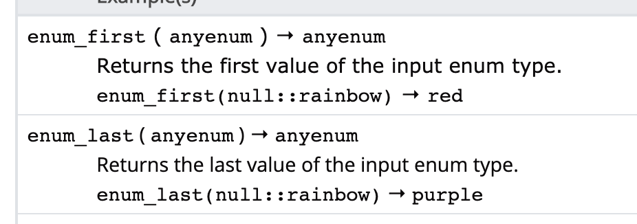
When I force it to verdana, we get the attached (enum_first has verdana,
enum_list has Open Sans). This seems to get the desired effect on the
function definition line, but it sets the descriptions to be verdana,
which seems to clash with the rest of the site.
(With my other comment of "can we get said signature into its own
row/block, I can make said issue go away easily :) Per your upthread
comment, I believe that would entail taking a go at DocBook and ensuring
it still looks good in the PDF build, which I am not ruling out trying...)
Another option is to make the font large in the tables, which helps with
the spacing. I'm not as much of a fan of that solution.
I did try using the "letter-spacing" CSS property, but the results
become fairly comical, fairly quickly.
I think Door #1 would be the optimal quick/best approach for a short
term resolution, pending other structural changes.
Jonathan
| Attachment | Content-Type | Size |
|---|---|---|

|
image/png | 53.6 KB |
In response to
- Re: Website patch request: documentation style update at 2020-04-18 19:34:16 from Tom Lane
Responses
- Re: Website patch request: documentation style update at 2020-04-18 20:21:50 from Tom Lane
Browse pgsql-www by date
| From | Date | Subject | |
|---|---|---|---|
| Next Message | Tom Lane | 2020-04-18 20:21:50 | Re: Website patch request: documentation style update |
| Previous Message | Tom Lane | 2020-04-18 19:34:16 | Re: Website patch request: documentation style update |