| From: | Shirley Wang <swang(at)pivotal(dot)io> |
|---|---|
| To: | Dave Page <dpage(at)pgadmin(dot)org> |
| Cc: | pgadmin-hackers <pgadmin-hackers(at)postgresql(dot)org> |
| Subject: | Re: [Design update] Style guide for pgAdmin4 |
| Date: | 2017-04-21 18:27:47 |
| Message-ID: | CAPG3WN7OtR+bLS00y=NPG4L0k+Ac==_JwYyjfWDtQB3D14LLsA@mail.gmail.com |
| Views: | Whole Thread | Raw Message | Download mbox | Resend email |
| Thread: | |
| Lists: | pgadmin-hackers |
Hello
>>>> Please feel free to edit the Sketch file- my only ask is new versions
>>>> hare named accordingly.
>>>>
>>>
>>> Is this the app you used? https://www.sketchapp.com/
>>>
>>
>> Yes. Also, I recognize it's probably not the best tool, given that
>> there's a 30 day free trial and then you need to purchase a license. I'm
>> looking into other programs that are free.
>>
>
> FYI, we use LucidCharts internally. It's a pretty good Google Apps
> integrated version of Microsoft Visio.
>
Ah ok. Do you have any files related to pgAdmin you can share (or put into
Google drive folder)?
>
>
>>
>>
>>
>>> Some initial thoughts on the inventory:
>>>
>>> - Wow, that's a lot of colours. I didn't realise we had so many. I think
>>> we need to work that down to a set of a dozen or less primary colours.
>>>
>>
>> Me neither! I'm not so concerned with the number of different colors, but
>> with the number of similar shades of each color.
>>
>> I can distill those down and send another email shortly.
>>
>>
>>>
>>>
>> - I wouldn't worry about the button colour borders and gradients too
>>> much. Those are standard bootstrap colours, so we should document them in
>>> terms of bootstrap styles, not colour components.
>>>
>>
>> Ok. But are they appropriate for this app?
>>
>
> Personally I think they're fine.
>
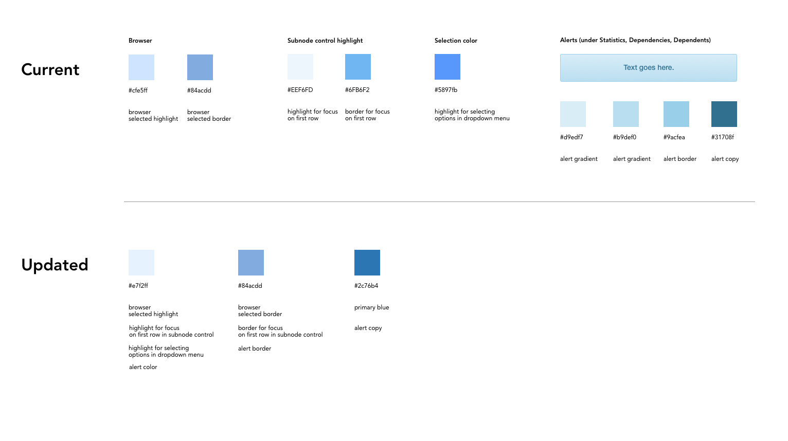
They seem ok for buttons (cancel, save, reset, toolbar). I found the
gradient is also on alerts when you click Dependencies, Dependents while
selecting Server in the browser.
I think those alerts should not have a gradient to match with the other
types of alerts (notifiers and error messages). Since these specific alerts
are not success / fail messages, the blue works because it's a neutral
color.
[image: highlight_selection color.png]
Here is what the updated colors would look like in the app.
*Focus on text field in nodes*
[image: Screen Shot 2017-04-21 at 12.13.53 PM.png]
*Browser*
*[image: Screen Shot 2017-04-21 at 12.14.55 PM.png]*
*Highlight in dropdown menu*
*[image: Screen Shot 2017-04-21 at 12.19.51 PM.png]*
*Alerts* [image: Screen Shot 2017-04-21 at 11.29.11 AM.png]
If this is ok, we will add these changes to our backlog as style changes.
| Attachment | Content-Type | Size |
|---|---|---|
| highlight_selection color.png | image/png | 78.8 KB |
| From | Date | Subject | |
|---|---|---|---|
| Next Message | Shirley Wang | 2017-04-21 18:36:44 | Re: [Design update] Style guide for pgAdmin4 |
| Previous Message | Josh Berkus | 2017-04-21 17:45:46 | Re: Some questions about configuration and the pgadmin4-v1-web package |