Re: Version 13 documentation layout is harder to read than version 12
| From: | Pavel Stehule <pavel(dot)stehule(at)gmail(dot)com> |
|---|---|
| To: | Tom Lane <tgl(at)sss(dot)pgh(dot)pa(dot)us> |
| Cc: | niels(at)thinkiq(dot)com, Pg Docs <pgsql-docs(at)lists(dot)postgresql(dot)org> |
| Subject: | Re: Version 13 documentation layout is harder to read than version 12 |
| Date: | 2020-09-29 14:32:12 |
| Message-ID: | CAFj8pRAc8EYV1C19PiL=XVp2b7g9m67oyGcMNHuM8KMDAJ4E+A@mail.gmail.com |
| Views: | Whole Thread | Raw Message | Download mbox | Resend email |
| Thread: | |
| Lists: | pgsql-docs |
út 29. 9. 2020 v 16:29 odesílatel Tom Lane <tgl(at)sss(dot)pgh(dot)pa(dot)us> napsal:
> Pavel Stehule <pavel(dot)stehule(at)gmail(dot)com> writes:
> > the new layout is probably better, but I miss some gentle separation of
> > these three parts - maybe using a different font?
>
> Hm? If you mean synopsis vs. description vs. examples, the description
> already is a different font from the other two.
>
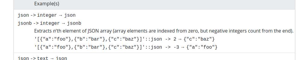
I have firefox and if there are different fonts, then for me it is
invisible.
see attached screenshot
> I recall that we did experiment with extra vertical whitespace to
> separate, but abandoned that, possibly because controlling it was too
> painful with DocBook.
>
> regards, tom lane
>
| Attachment | Content-Type | Size |
|---|---|---|
|
image/png | 31.0 KB |
In response to
- Re: Version 13 documentation layout is harder to read than version 12 at 2020-09-29 14:29:19 from Tom Lane
Responses
- Re: Version 13 documentation layout is harder to read than version 12 at 2020-09-29 14:35:15 from Pavel Stehule
Browse pgsql-docs by date
| From | Date | Subject | |
|---|---|---|---|
| Next Message | Pavel Stehule | 2020-09-29 14:35:15 | Re: Version 13 documentation layout is harder to read than version 12 |
| Previous Message | Tom Lane | 2020-09-29 14:29:19 | Re: Version 13 documentation layout is harder to read than version 12 |